Find My Class
- My Role: Researcher
- Other Members: User Interface Designer
- Project date: October, 2019 - December 2019
- Tooles Used: Adobe CC, Google Drive, iOS memos, Adobe CC
Project Goals
The goals of this project was to determine how students and faculty feel about finding classes and services at Algonquin College. We also wanted to see how they are solving their issues to discover the pain points when trying to find their way around Algonquin College.
Research Questions
Are students and faculty having an issue finding classes and services at Algonquin College?
How are they currently solving the issue?
What solutions does Algonquin College currently offer?
What is working (if anything)?
Discover
Methodology
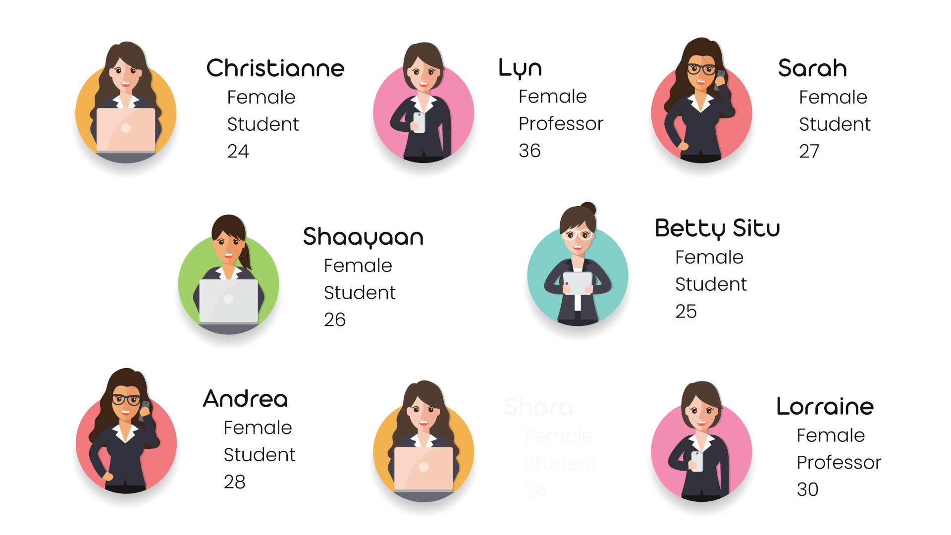
Our approach was to conduct 1:1 interviews with current students, returning students, international students, and faculty of Algonquin College.
We had interviewed a total of 8 participants. 6 students and 2 faculty members.
Define
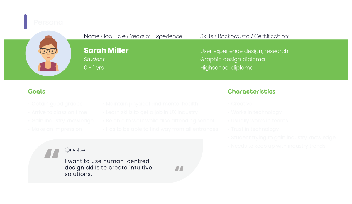
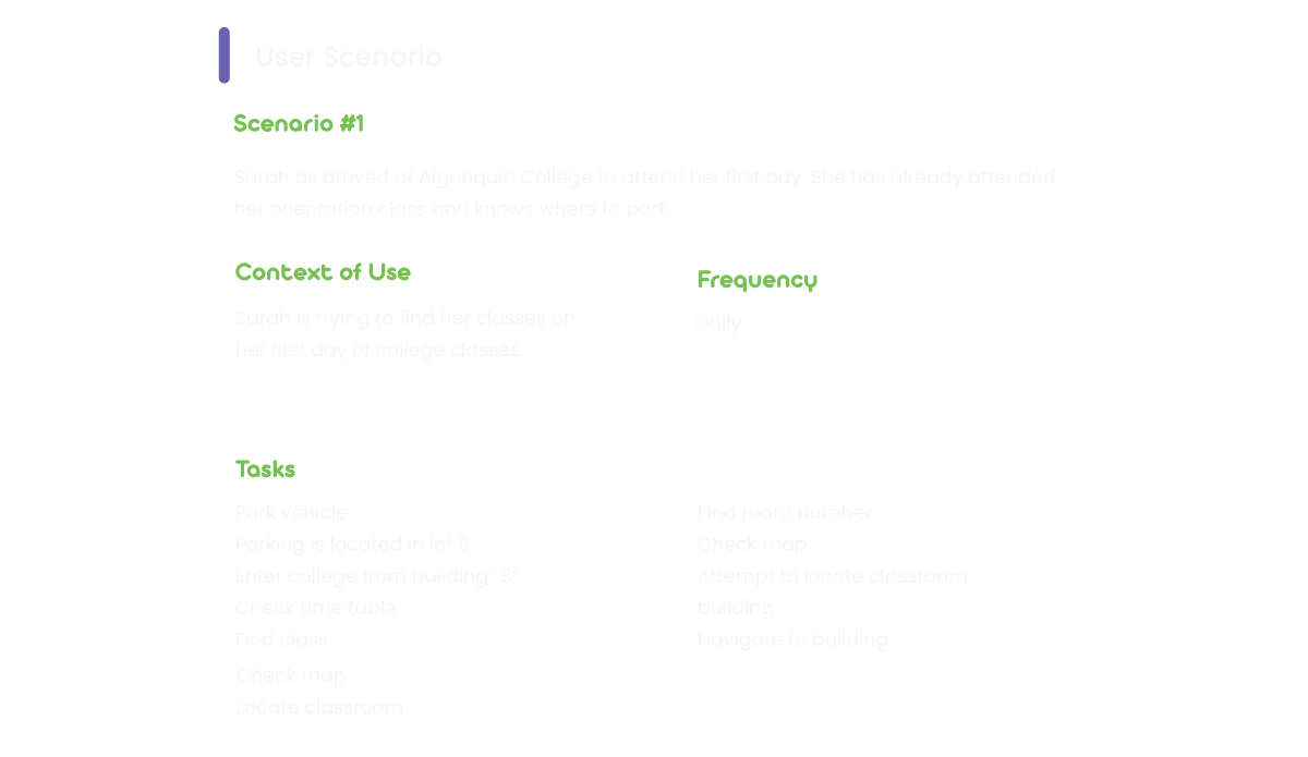
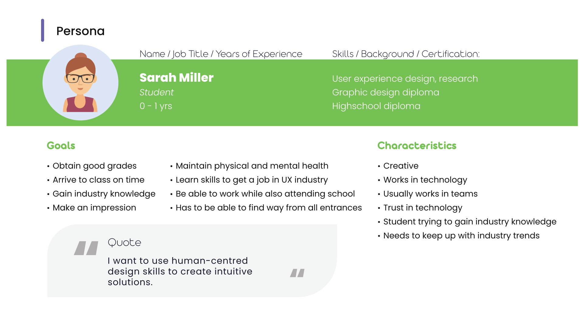
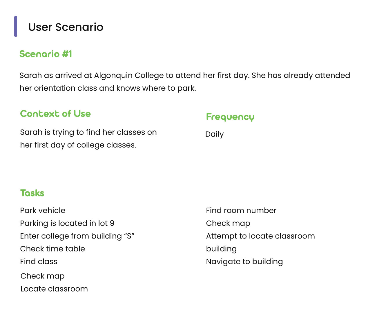
After our initial round of interviews, we had put together a user persona to help us identify who our users are. Also, we constructed a use scenario to outline the context of use when trying to find classes.
Our Findings
The general findings from our 1:1 interviews is that there is an issue with the
wayfinding at Algonquin College. These issues particularly stand out when
trying to access classes in the “B” building on campus. Students and faculty
have a hard time not only finding the building, but when arriving, the
classroom numbers do not seem to follow logic.
Our users had mentioned that they would ask for help when trying to find
their way around the college. They would speak to people running
orientation kiosks, other students, other faculty, or even worked in groups to
try and find their classrooms. Most users tend to stay away from the maps as
they are confusing. One faculty user had said that some of the maps around
Algonquin Colleges campus are actually mounted upside down.
Due to the building's alphabetic system, most students had a hard time
finding the different buildings from inside the college. So they had chosen to
walk around outside to try and find the correct building.
Students and faculty used landmarks to help find their way. This could be
cafes, offices, and other classrooms and hallways.
Recommendations
From our findings, users cannot easily find their way around the
college. Maps are confusing, digital solutions are not intuitive, and
asking others for help can result in getting lost.
Our recommendations to resolve student, faculty, and even visitor
wayfinding is to provide a more intuitive map system. Users seem to
consult the map as one of their first options to find their way around
the college. However, the current map system seems to be a major
pain point for users.
One option could be a digital map located at different entrances of
the college. This system would allow the user to enter their classroom
or search for college services. Also, this digital map could have a
companion application for mobile smart devices. This could take advantage of augmented reality technology and provide an exact guide
via directions on the screen.
Design
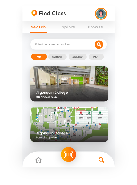
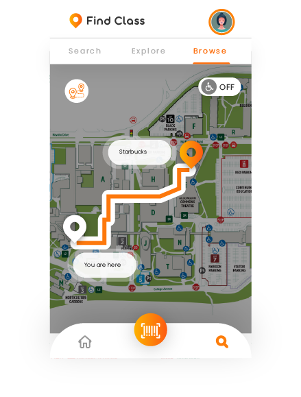
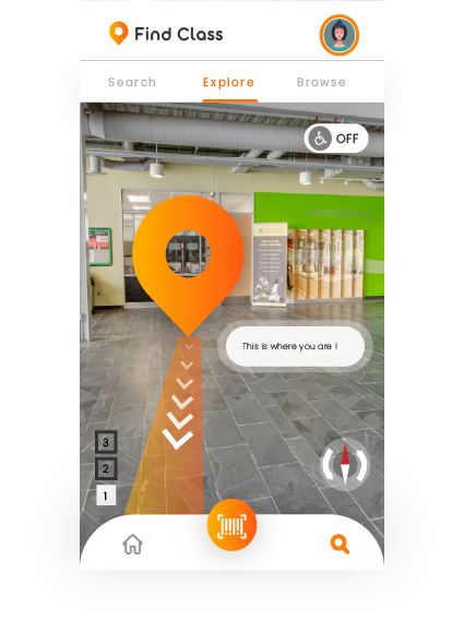
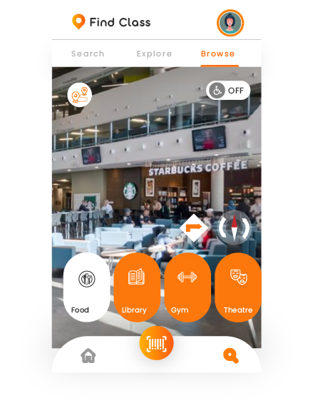
After our brainstorming session, we were able to define our problem statement. How might we provide an easy to understand map application so users can safely and quickly navigate the Algonquin College Campus. To solve this problem, we had prototyped an augmented reality mobile application. This application would display your class schedule as well as give directions to your point of interest (classes and other accommodations). Users would scan one of the many QR codes located at different entrances around Algonquin College Campus to start their navigation
Testing
We had created an interactive prototype of the application to test with our target users. The prototype was created using Adobe illustrator (to create the screens) and inVision app (for interactions).
The prototype consisted of:
- Splash screen
- Login Screen
- Dashboard
- ollege entry point screen (map of college)
- Food selection screen
- Navigation screens (photos to demonstrate AR navigation)
- Map poster that included QR code
- Lost? Poster that included QR code
The goal of the testing was to see how users would search for
two different waypoints in the college; their upcoming class and
Starbucks.
Users navigated the prototype to complete tasks from two
differnet Scenarios
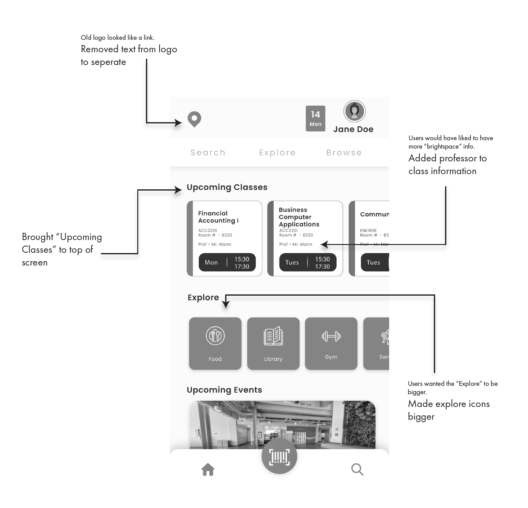
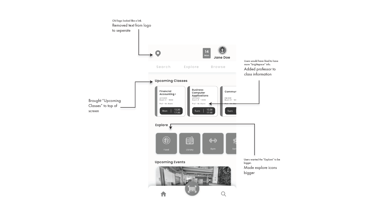
Findings
One thing that we found when testing is that all the users we tested went a
completely different route when searching for the classroom. Also, some features of
the application were slightly unintuitive.
The following is just some of the recommendations for change to the application